Chegg

Student-centered experience

Three UX case studies from my time at Chegg, where I focused on creating accessible, intuitive experiences for millions of students worldwide. For a detailed walkthrough, contact me.

01

The course dashboard

Redesigning the course dashboard to add useful features to help students excel in their coursework.

Study Tools Redesign mockups

Context

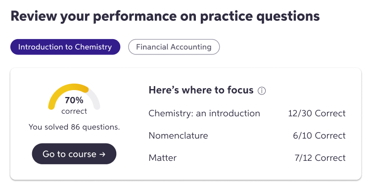
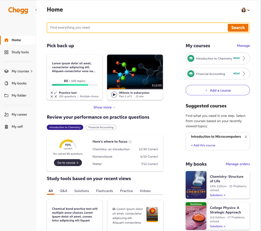
As Chegg grew as a company, they launched a 'Course Dashboard' that can be accessed from the home page when a user is signed in. This dashboard allows paid subscribers to add courses, access instructor-made documents, save related textbooks, post questions, practice flashcards and more. In an effort to create more value for paid subscribers, Chegg introduced new features to the course dashboard.

Objectives

  • Design the new modules on the course dashboard
  • Achieve optimal information hierarchy for the newly added modules
  • Ensure discoverability and create tangible value for students
  • Increase repeat visits to the course dashboard and potentially increase number of paid users

Challenges

  • Work with limited real estate on the course dashboard page
  • Create an engaging experience that is also easy to follow

The team

  • 2 product managers
  • 1 UX researcher
  • 1 product designer
  • 1 content designer
  • 3 developers

My role

Lead the content design and co-lead the overall UX strategy for the entire project. Align cross-functional collaborators and get timely feedback on each iteration. Balance user and product needs in every step of the way.

The process

Brainstorming session showing ideation process with sticky notes
1

Discovery & research

Conducted user interviews, analyzed previous usage data, and performed competitive analysis to understand pain points and opportunities.

2

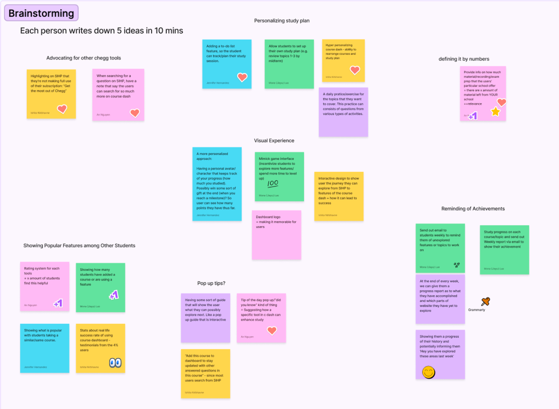
Brainstorm & ideation

Facilitated design workshops with stakeholders, created user journey maps, and developed multiple concept directions based on research insights.

3

Prototyping & testing

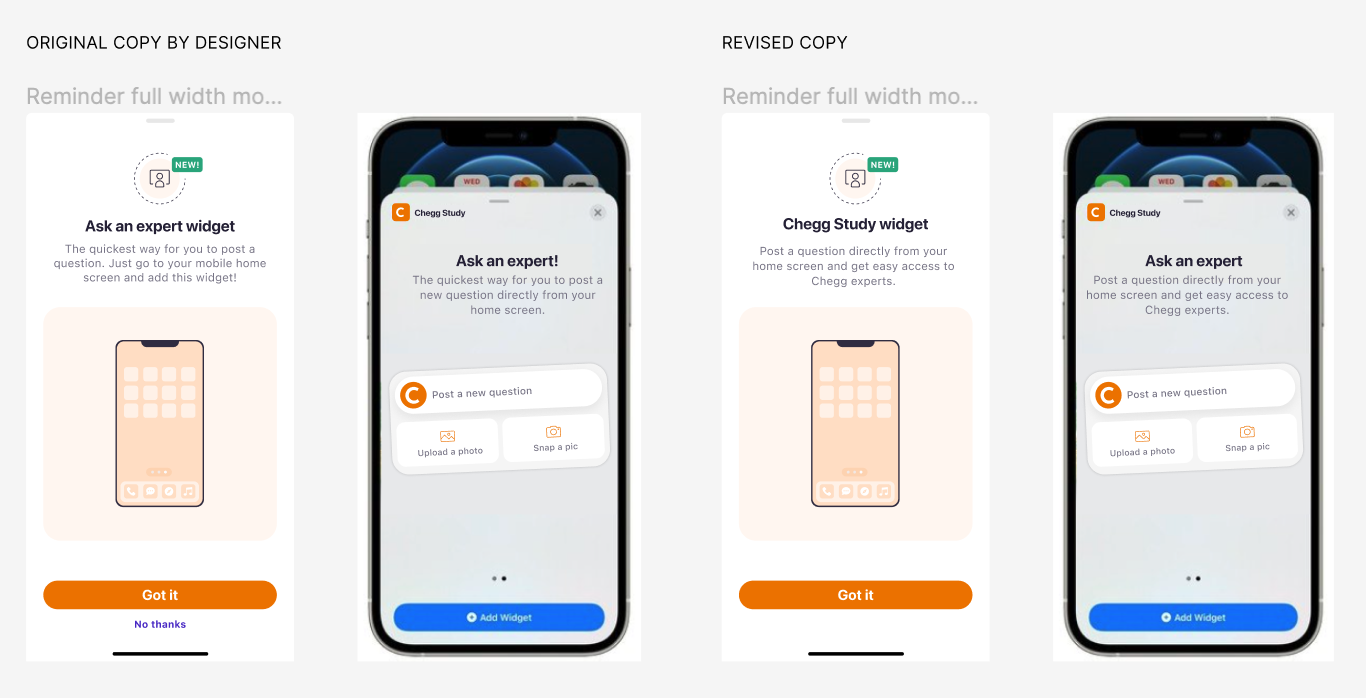
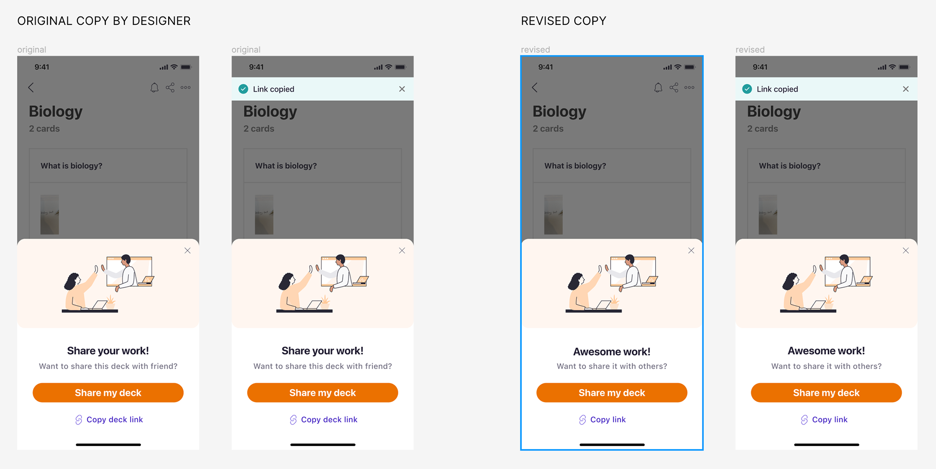
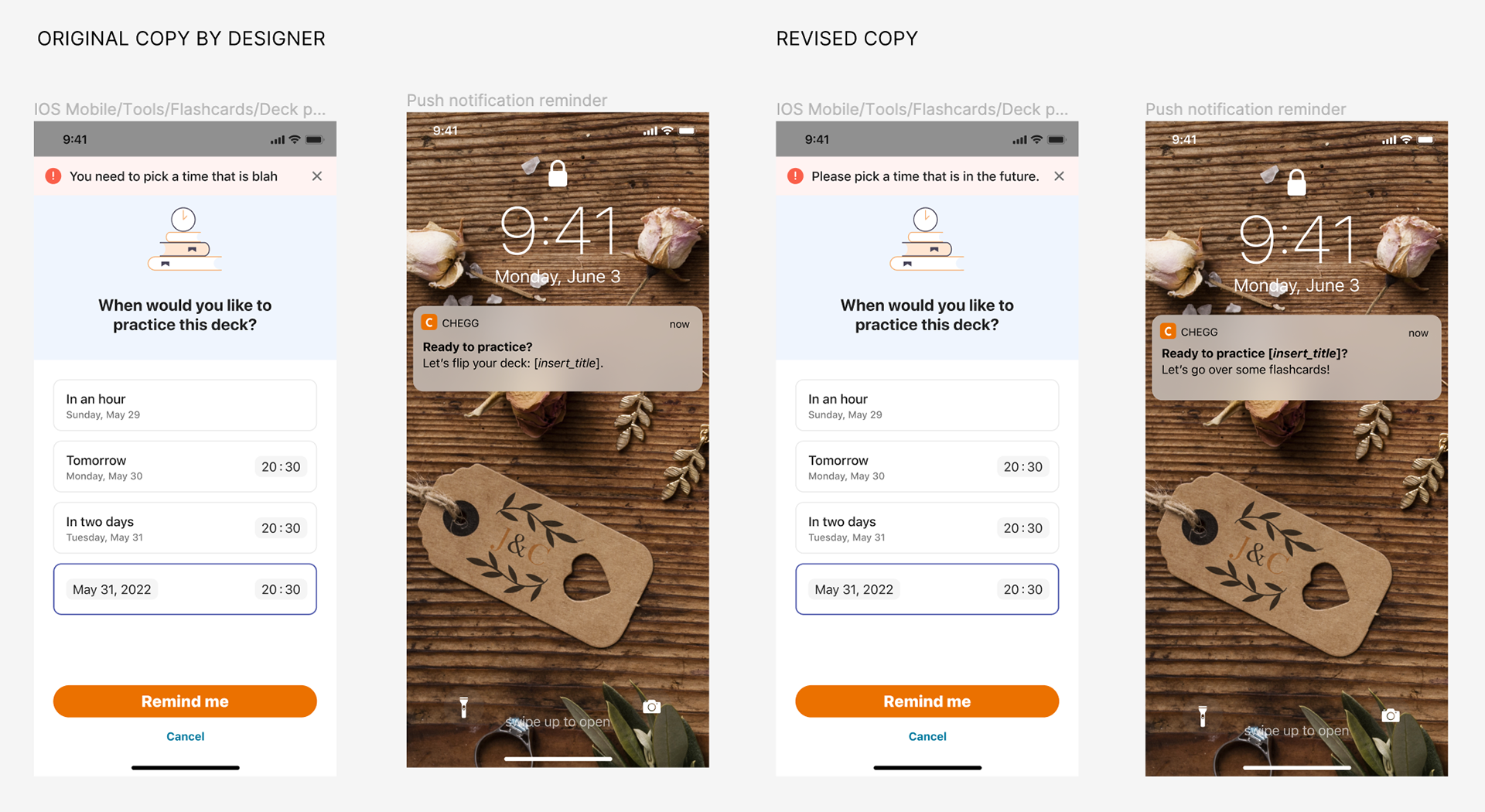
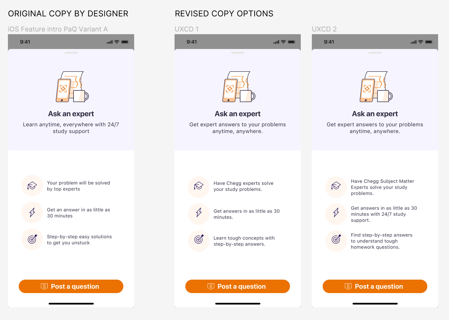
Built interactive prototypes wwith polished content and conducted moderated usability tests with students to validate design and content decisions and iterate on solutions.

4

Implementation & launch

Collaborated with engineering on technical specifications, created design documentation, and monitored post-launch metrics to measure success.

Final state

The redesigned study tools launched with a 32% increase in daily active users and 45% improvement in study session completion rates. The new design system was adopted across three additional product areas, and user satisfaction scores increased by 28%.

Final design screens Final design screens
02

The Chegg app

Writing clear and concise microcopy, error messages, and onboarding tips with a character limit.

Context

The Native team at Chegg developed 2 apps: Chegg Prep and Chegg Study for iOS & Android. I worked on several screens for Chegg's apps and iterated on feature introductions, push notifications, widgets, and more.

'Ask an expert' widget

Introducing a new Chegg widget to users: The 'Chegg Study' widget

  • Renamed the widget to 'Chegg Study' to comply with iOS widget standards
  • Reworked the widget intro description to achieve clarity and concision
  • Removed the 'No thanks' secondary button since it's a bottomsheet component and fairly intuitive to close
Ask an expert widget comparison showing original vs revised copy

'Share a deck' popup

Once users create a deck of flashcards to practice, we allow them to share it with their peers.

  • Using the rare opportunity to create content that sparks delight i.e "Awesome work!"
  • Following it up with a direct question and simple + relevant calls to action
Ask an expert widget comparison showing original vs revised copy

'Flashcard' reminder

Once users create a flashcard deck, they can set a time when the app will notify them to pratice these flashcards.

Ask an expert widget comparison showing original vs revised copy

'Post a question' onboarding

This feature lets students post a question that subject matter experts will answer quickly and thoroughly.

  • The subheading keeps the main value proposition clear for users.
  • Each point focuses on a unique value proposition of the feature and highlights why it's worth a try.
  • No over-promising. Just clarity and value.
  • Ask an expert widget comparison showing original vs revised copy

Final state

These were fairly quick deliverables that I worked on with the Native team. All of my iterations went live on the app.

03

Content design style guide

Creating a style guide for Chegg's content design system.

Onboarding flow mockups

Context

The UX team at Chegg didn't have a consistent standard for content-heavy components like notifications, onboarding guides, or error messages. My manager asked me to explore a solution, so I began creating a style guide in Figma. This guide lives within the larger design system and gives designers ready-to-use components they can pull from directly.

Objectives

  • A holistic UX content resource
  • Easy access for all cross-functional partners
  • Consistency across product verticals
  • Amplifying accessible, effective, and easy-to-localize content principles

The team

  • 1 product managers
  • 1 UX researcher
  • 3 content designers
  • 1 product designer

My role

Lead content designer for the style guide: creating and organizing high-level sections, assigning tasks to the team, contributing to the style guide, ensuring consistency. Complete end-to-end execution.

The process

1

Research & outline

Researching and reviewing existing content guidelines across the industry, especially competitors. Creating an outline of the style guide, presenting it internally for feedback.

2

Structure

Assigning sections of the style guide to the content team including myself (documented through JIRA and Confluence).

3

Execution

Finalizing sections after async feedback and QA. Collaborating with the designer to create a creative and easy-to-edit Figma template for the style guide. Transferring finalized sections of the guide to Figma.

4

Refine and launch

Opening the guidelines for designer feedback and accessibility check. Refining the guidelines, sections, and template based on feedback. Launch for internal use.

Final state

Based on the feedback, all relevant cross-functional stakeholders found great value in the style guide. Product designers found it easy to pull from the guide and kepe their design files ready for content iterations. PMs and engineers better understood content design principles. Lastly, content designers reported increased efficieny in their processes.

Interested in the full case studies?

These project overviews represent a snapshot of my work at Chegg. I'd be happy to discuss the detailed research methods, design decisions, and outcomes in more depth.